
Client
A Spacious Place
Season
Fall 2023
Timeline
10 Weeks
A Spacious Place empowers individuals through creative programs and community engagement. However, their website's critical accessibility issues, including poor mobile responsiveness and English-only content, created barriers that limited their mission's reach and impact.
project overview
Focus Areas
Social Good, Responsive Design, Multilingual Support, User-Centric Design, Inclusivity, Digital Accessibility, SEO Optimization, Stakeholder Engagement, Community Outreach, Content Strategy
Agile Methodology
Tools and Software Used

Google Docs

Figma

Google Suite

HTML

CSS

Wordpress

Trello

Slack
scope + constraints
Over 10 weeks, our interdisciplinary team transformed A Spacious Place's website, participating in the Accessibility Internet Rally (AIR). We focused on creating a universally accessible platform, prioritizing responsiveness and multilingual capabilities, significantly improving user engagement and organizational efficiency.
team + role
As the primary UX Designer and the project's Design and Research Lead, I spearheaded the development efforts, playing a crucial role in project management and client interactions. Our diverse team consisted of five students, including myself, and our professor, filling the roles of designers, developers, quality assurance specialists, and researchers. Together, we collaborated effectively to exceed the client's objectives and deliver significant enhancements to the website.
challenges
The original website's poor accessibility compliance, lack of mobile responsiveness, and English-only content created significant barriers for students and their caretakers to access vital program information. Complex navigation and engagement processes further hindered both families seeking services and supporters looking to contribute time or resources, critically limiting the organization's community impact.
goals
Create a fully accessible website that meets WCAG standards, delivers a seamless mobile experience, and provides multilingual support to better serve the diverse community. Streamline the user experience through intuitive navigation and simplified engagement pathways, making it easier for families to access programs and supporters to contribute their time and resources.
outcomes
The redesign achieved a 33.5% increase in accessibility with perfect WCAG compliance scores, while introducing seamless bilingual support and improving both mobile and desktop performance for enhanced SEO impact. By streamlining engagement pathways for donations and volunteering, the new website better serves its diverse community, making it easier for supporters to contribute and families to access vital programs.
discovery highlights
Client Brief
During the AIR Kickoff event, we met with A Spacious Place's leadership to understand their organization's mission and the challenges their community faced. Key insights revealed that their website was creating unintended barriers for their diverse audience, particularly affecting:
Students with varying abilities trying to access program information
Non-English speaking families attempting to engage with their services
Mobile users struggling to navigate the site
Caretakers unable to find clear program registration pathways

Our comprehensive accessibility audit revealed numerous critical issues impacting user engagement, from fundamental navigation problems like unconventional page naming and inconsistent information architecture to serious accessibility violations including 52 YouTube videos without transcripts, missing alt text descriptions, and failed contrast ratios (2.58:1 to 3.99:1, below WCAG standards). The site's English-only content and complex navigation paths created significant barriers, with mobile responsiveness issues affecting 60% of users. These technical shortcomings translated into real community impact: students couldn't access video content independently, families missed program opportunities due to language barriers, mobile users abandoned registration attempts, and screen reader users struggled to navigate effectively. These findings shaped our clear redesign priorities: implementing accessible multimedia content, creating intuitive navigation, ensuring WCAG 2.1 compliance, developing multilingual support, and optimizing mobile responsiveness.
During our initial discovery phase, we identified four key stakeholder groups who would interact with the website. Our research revealed that focusing on student caretakers as the primary audience would create the most significant impact for the organization's mission. This audience analysis directly informed our design decisions, ensuring that the website redesign would effectively serve all stakeholder groups while prioritizing the needs of student caretakers for maximum organizational impact.
Primary Audience: Student Caretakers
audience profile
Parents and guardians managing program participation for students with diverse abilities
Varying levels of technical literacy and English proficiency
Primary decision-makers for program enrollment
Key Pain Points
Difficulty finding and registering for relevant programs
Language barriers with English-only content
Unclear communication channels for program updates
Challenges accessing information on mobile devices
Design Implications
Multilingual support with seamless language switching
Clear program categorization and registration pathways
Mobile-first design for on-the-go access
Integrated calendar features for program scheduling
Organization Leadership
audience profile
A Spacious Place staff and administrators
Program coordinators and instructors
Content managers
Key Pain Points
Website not effectively supporting mission delivery
Difficulty updating program information
Limited ability to showcase impact
Engagement tracking challenges
Design Implications
Streamlined content management system
Integrated analytics tools
Flexible program showcase features
Simplified event management
Donors, Sponsors & Volunteers
audience profile
Parents and guardians managing program participation for students with diverse abilities
Varying levels of technical literacy and English proficiency
Primary decision-makers for program enrollment
Key Pain Points
Difficulty finding and registering for relevant programs
Language barriers with English-only content
Unclear communication channels for program updates
Challenges accessing information on mobile devices
Design Implications
Multilingual support with seamless language switching
Clear program categorization and registration pathways
Mobile-first design for on-the-go access
Integrated calendar features for program scheduling
organization students
audience profile
Age range: 4-70 years
Diverse physical and cognitive abilities
Varying levels of digital literacy
Key Pain Points
Navigation difficulties on mobile devices
Inaccessible program information
Challenges finding relevant creative resources
Barriers to independent website use
Design Implications
WCAG 2.1 compliance across all pages
Intuitive navigation with clear visual cues
Simplified content structure
Accessible multimedia content
planning
Armed with comprehensive audit findings, we implemented an agile planning strategy that prioritized critical accessibility needs. Breaking the project into focused sprints enabled us to tackle foundational issues first - starting with WCAG compliance, then advancing to mobile optimization and content restructuring. Weekly sprints with clear deliverables kept us accountable while allowing flexibility to incorporate ongoing feedback from stakeholders and user testing. This systematic yet adaptable approach ensured we could deliver meaningful improvements within our 10-week timeline while maintaining rigorous accessibility standards.
process highlights
building fidelity
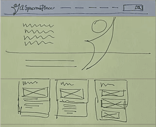
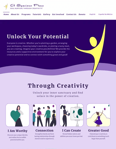
From paper sketches to Figma to Wordpress we designed and iterated on the website updates guided by discovery research and stakeholder meetings with the client to ensure that it aligned with their goals and brand voice.

Strategic Pivot
When our initial interactive calendar solution presented accessibility and technical challenges, we streamlined the approach. By implementing a structured event list with Google Calendar integration, we created a more accessible and maintainable solution that better served both users and the organization's needs while preserving project resources.
brand evolution
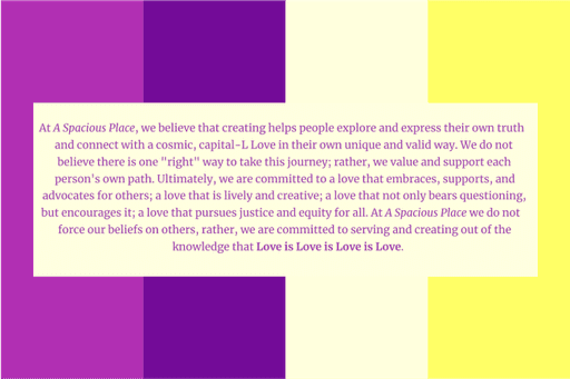
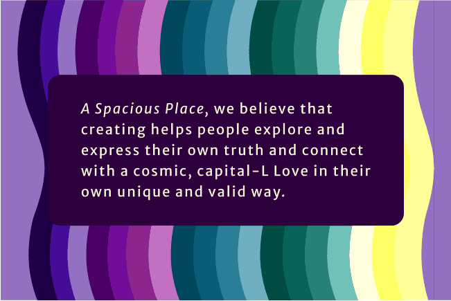
Building upon the organization's core palette of purple, magenta, and yellow tones, we expanded the brand's digital expression to better reflect their creative spirit while improving accessibility. We introduced softer visual elements like rounded corners and wave shapes inspired by student artwork, creating a more welcoming interface. Typography was refined by pairing Merriweather with Merriweather Sans and implementing scalable units, enhancing both readability and visual cohesion across the site.
feature highlights

Streamlining Community Participation
Clear Engagement Pathways
challenges addressed
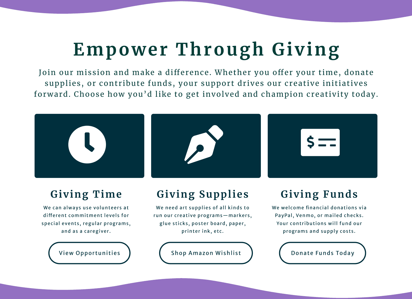
The original website's scattered engagement options and complex contribution processes created significant barriers to participation. With key options like volunteering and donations buried throughout the site and overly complicated processes, potential supporters faced unnecessary friction that reduced their likelihood of contributing time or resources to the organization's mission.
solution overview
We implemented streamlined engagement pathways with prominent, intuitive access points for all contribution types. This included integration with VolunteerMatch for seamless volunteer coordination and simplified donation options through multiple payment platforms, all accessible through clear calls-to-action throughout the site.
projected impact
These optimized engagement pathways will reduce barriers to participation, leading to increased volunteer recruitment and higher donation rates. By simplifying the process of contributing to the organization's mission, the website better serves both the community's desire to help and the organization's need for sustained support through volunteering, donations, and event participation.

Streamlining Event Access
connected calendars
challenges addressed
The original website's fragmented event information created significant barriers for families trying to participate in programs. With only yearly and seasonal events listed, and no integration of weekly classes, caretakers were forced to repeatedly contact the organization or revisit the website for updates – creating friction that reduced program participation.
solution overview
We implemented a structured event listing with Google Calendar integration, allowing users to seamlessly add events to their personal calendars. This streamlined solution enables the organization to easily manage events through WordPress while automatically keeping families informed of all programming – from weekly classes to special events.
projected impact
This simplified approach will reduce administrative burden through fewer inquiries about scheduling, increase program participation through better accessibility to event information, and strengthen community engagement by making it easier for families to plan their involvement with the organization. The integration with families' personal calendars ensures they stay connected to programming opportunities without requiring additional effort to check the website.
Building an Inclusive Digital Space
Accessibility Compliance
challenges addressed
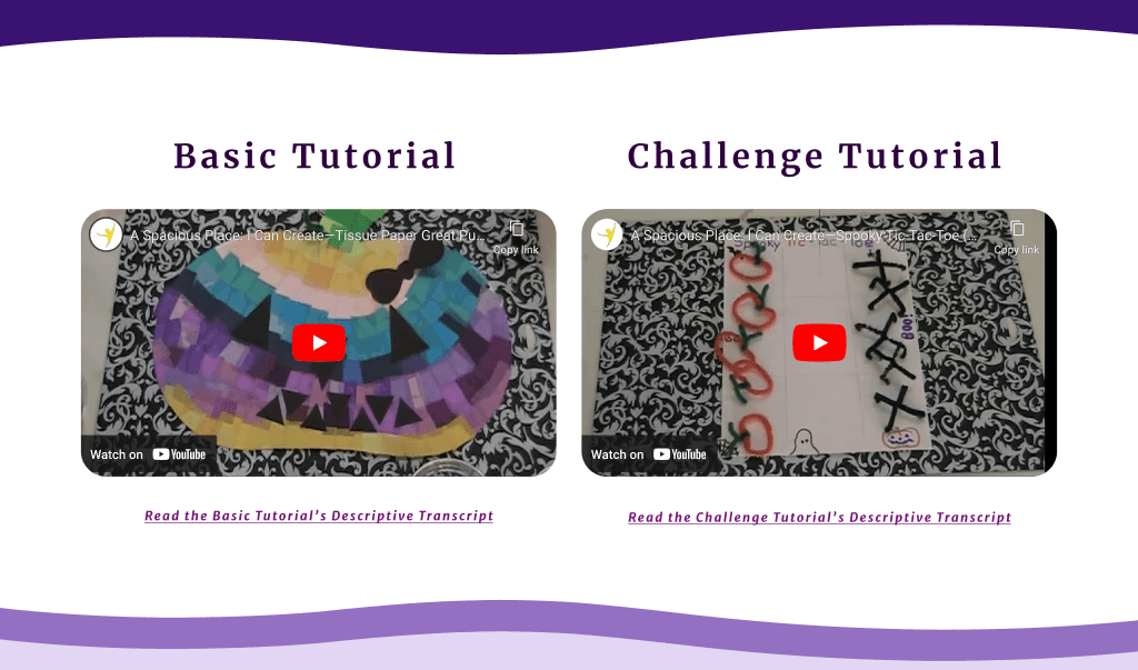
The original website failed to meet essential WCAG standards, with missing alt text, poor semantic structure, and inaccessible media content creating significant barriers for users with disabilities and hindering overall engagement with the organization's mission.
solution overview
We implemented comprehensive accessibility improvements, including proper alt text, semantic HTML structure, and WCAG-compliant color contrasts. The redesign achieved 100% accessibility scores across all pages while maintaining visual appeal through an expanded color palette and responsive typography.
projected impact
This foundation of accessibility compliance will expand the organization's reach to all community members, reduce legal risks, and improve SEO performance. Most importantly, it ensures every user, regardless of ability, can fully engage with the organization's programs and resources, advancing their mission of inclusive community engagement.
Breaking Language Barriers
Multilingual Support
challenges addressed
The English-only website excluded a significant portion of the community from accessing vital program information, limiting the organization's ability to serve families who primarily speak Spanish and hindering their mission of inclusive community engagement.
solution overview
We implemented seamless language toggling between English and Spanish across the entire website, ensuring consistent translation of all program information, event details, and engagement opportunities.
projected impact
This multilingual support will expand the organization's reach within Spanish-speaking communities, increase program participation through improved accessibility, and strengthen their commitment to serving all families regardless of language preference. The removal of language barriers opens new pathways for community engagement and supports the organization's mission of inclusive creative development.
status + reflection
project status
Project concluded after the competition, with the redesigned website handed over to the client for ongoing maintenance and updates. Recognizing that digital projects are always evolving and that continuous research is critical, if this project were ongoing, the following next steps would be prioritized, balancing effort with anticipated impact.
reflection
Completing the A Spacious Place website redesign within ten weeks was a journey of significant personal and professional growth. Leading the project sharpened my project management skills, deepened my understanding and hands-on experience with accessibility design, and improved my ability to articulate ideas and negotiate solutions with stakeholders.

