Client
Dev Launchers
Season
Summer 2022
Timeline
Ongoing
Dev Launchers faced inefficiency and inconsistency across design and development due to repeated efforts in creating common UI components, which affected team productivity and learning opportunities.
project overview
Focus Areas
Design System, Atomic Design, Modular Design, Non-Profit, Cross-Functional, Brand Identity, Accessibility, Responsive Design
Tools and Software Used

Google Docs

Figma

Google Suite

HTML

CSS
scope + constraints
The Universal Design System project at Dev Launchers transformed the organization’s approach to consistency, accessibility, and efficiency across six internal product teams. This comprehensive system includes reusable components, styles, and guidelines, ensuring a cohesive and accessible experience across global design efforts.
team + role
Originally a solo initiative, the project has since evolved to include a team of researchers and designers, including myself, and is now supported by an internal development team.
As UX Designer, UX Lead, and Accessibility Consultant, I launched the project in June 2022 by identifying inefficiencies in design practices and repetitive tasks within the organization. I developed the initial atomic design styles and component library. Currently, my focus is on implementing Figma variables and refactoring components, supporting the ongoing evolution of our design system to enhance usability and efficiency.
challenges
Break the Cycle: The Dev Launchers teams struggled with inconsistency and inefficiency due to the repetitive design and development of common UI components and patterns, which slowed progress toward their career goals.
goals
The primary goals were to ensure platform consistency and accessibility across all products, provide opportunities for designers and developers to gain hands-on experience with a shared design system, and improve overall team efficiency in designing and developing app iterations.
outcomes
The design system now supports six internal teams globally, with over 1,400 components built using an atomic design model and 30+ Figma variables, allowing dynamic updates across themes and devices while fostering collaboration and accessible learning.
discovery highlights
Our design system was responsible for creating consistency and accessibility across our platform for internal design and development teams, as well as external users of Dev Launchers apps. Our primary audience that the system holds the most direct impact for is our internal design and development teams.
Dev Launchers
Who: A non-profit organization dedicated to helping individuals launch their tech careers by bridging the gap between education and experience through supporting and educating cross-functional software project teams.
Needs & Goals: Present a clear and consistent identity and produce products more efficiently.
Challenges & Pain Points: Ensuring all teams adhere to the design system guidelines.

Designers
Who: User Experience and Graphic Designers at Dev Launchers responsible for designing wireframes, mockups, and prototypes of our internal apps.
Needs & Goals: Build and iterate their team's products efficiently while aligning with accessibility practices and the organization's branding.
Challenges & Pain Points: Ensuring consistency and efficiency across various projects.

External Audience
Who: Individuals who use or engage with Dev
Launchers apps.
Needs & Goals: Accessible and engaging content that inspires confidence in Dev Launchers.
Challenges & Pain Points: Ensuring ease of use and accessibility.

Developers
Who: Front-End and Back-End Developers responsible for developing our internal apps.
Needs & Goals: A single source of truth for values
used throughout our system and codebase, reducing redundancy and enabling modular development.
Challenges & Pain Points: Maintaining consistency and integration with design components.
Strategic Planning
Planning Independently
During the initial production of the design system, I prioritized components based on their complexity, focusing on atomic elements as building blocks and their frequency of use throughout our organization.
Component Reusability and Scalability
As the component library grew more functional and comprehensive, the Platform Enablement Team, consisting of Front-End Developers, began building the component library using React, Tailwind CSS, HTML & CSS, JavaScript, and TypeScript. Weekly meetings and asynchronous communication through Storybook facilitated collaboration and clarification. My role with the Platform Enablement Team involved ensuring that design principles were consistently applied and that any issues were promptly addressed to maintain the integrity and efficiency of the design system.
Accessibility Focus
As the platform enablement team progressed, the Universal Design Team was created to facilitate further iteration, research, and expansion of the design system and its component library. During this time, I pursued a degree in User Experience Design, transitioning to a supportive design, accessibility, and consultant role. Since graduating, I have returned to a more active role, spearheading the initiative to incorporate Figma Variables into our design system.
Adobe Spectrum Guide
ideation & choices
During the ideation phase, I drew inspiration from industry-leading design systems and tailored these insights to meet our organization's unique needs and objectives. This phase was pivotal in laying the foundation for a robust, scalable design system that promotes consistency, accessibility, and efficiency across all our products.
Atomic Design Principles
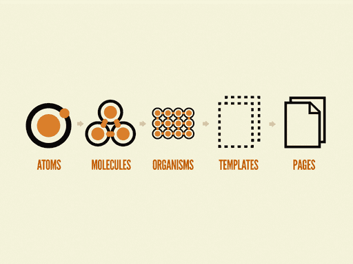
I adopted the atomic design methodology to break down UI components into fundamental building blocks. This approach facilitated a modular design system where smaller, reusable components form the foundation for more complex UI elements.
Component Reusability and Scalability
From Adobe’s Spectrum, I learned the importance of designing components that are not only reusable but also scalable to meet diverse requirements. This insight helped ensure our design system could grow and adapt over time.
Accessibility Focus
Both Atomic Design and Spectrum emphasized accessibility, guiding me to incorporate accessible design principles from the outset. This focus ensured our components and guidelines adhered to WCAG standards, making our products more inclusive.
process highlights
Brand Book to Style Guide
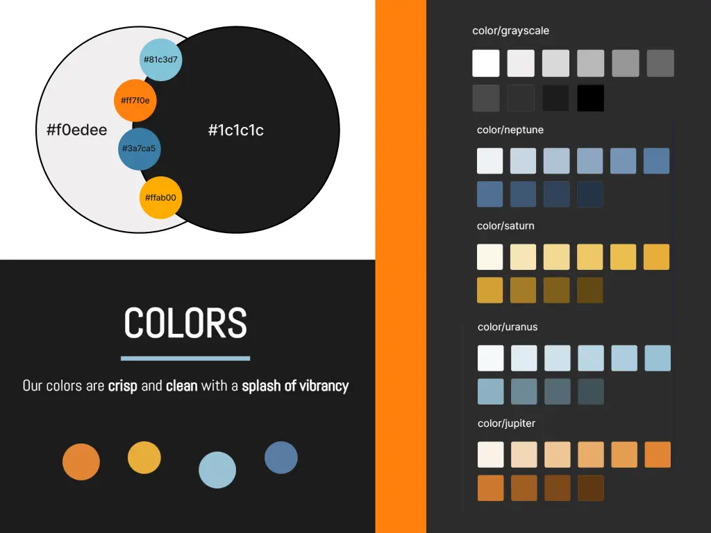
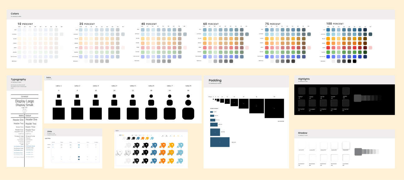
The first step in the design system's development was translating Dev Launchers' brand book into a comprehensive style guide. The resulting style guide provided a solid framework for our design system, ensuring all design work aligned with Dev Launchers' brand identity and accessibility goals.
Defining Visual Elements
I extracted and defined key visual elements such as colors, typography, and logo usage. These elements served as the foundation for our style guide.
Creating Consistency
The style guide established rules and guidelines to ensure visual consistency across all products and communications. This consistency is crucial for brand recognition and user trust.
Ensuring Accessibility
I incorporated accessibility guidelines into the style guide, ensuring color contrast, text readability, and overall usability met inclusive design standards.

style guide to component library
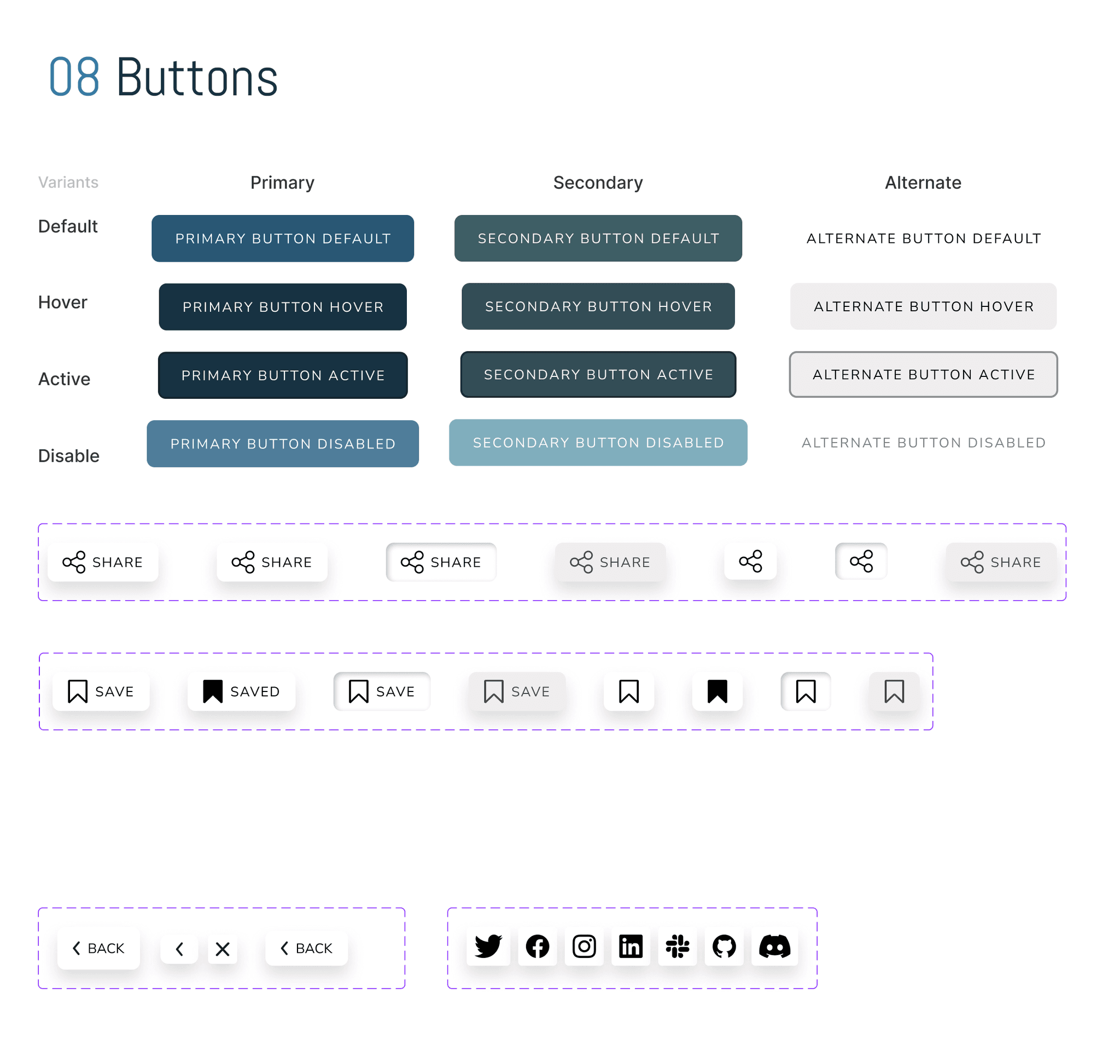
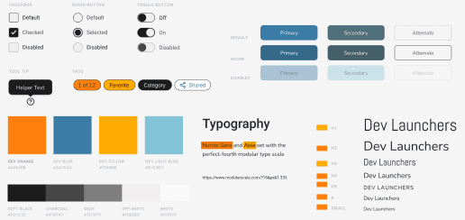
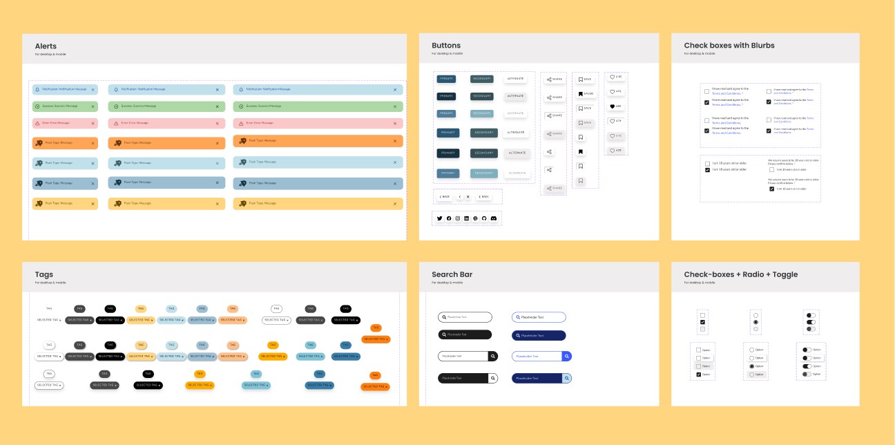
To move from style guide to component library I used to factors to prioritize what components were designed first: atomic level and frequency of use within our current products. Prioritizing elements we used frequently in our current products such as cards, buttons and tags and identifying the smallest subcomponents and addressing those first allowed me to build quickly and get the most needed components quickly delivered to our teams for the most immediate impact.
Component Library to Design System
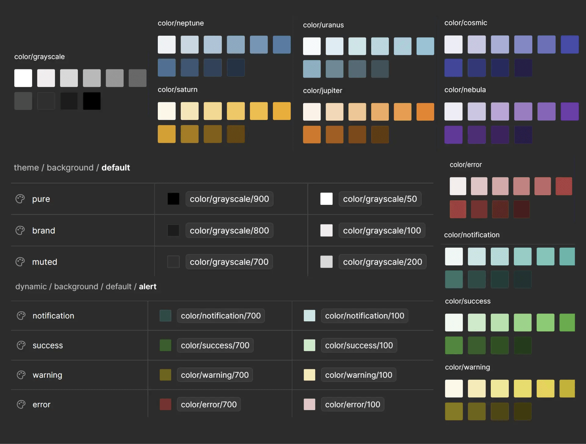
The final step was evolving the component library into a full-fledged design system. By evolving the component library into a holistic design system, I created a cohesive framework that supports all aspects of our design and development efforts, driving consistency, efficiency, and accessibility across Dev Launchers' products.
Cross-Functional Collaboration
I fostered collaboration between designers and developers, ensuring seamless integration of the design system into our development processes. Tools like Storybook facilitated this collaboration by providing a shared platform for documenting and showcasing components.
Comprehensive Guidelines
I expanded the documentation to include comprehensive guidelines for design and development, covering topics such as component customization, responsive design, and accessibility.
Ongoing Maintenance and Iteration
Recognizing that a design system is never truly complete, I established processes for ongoing maintenance and iteration. Regular reviews and updates ensured the system evolved with changing needs and technological advancements.
feature highlights
Accessibility integration
challenges addressed
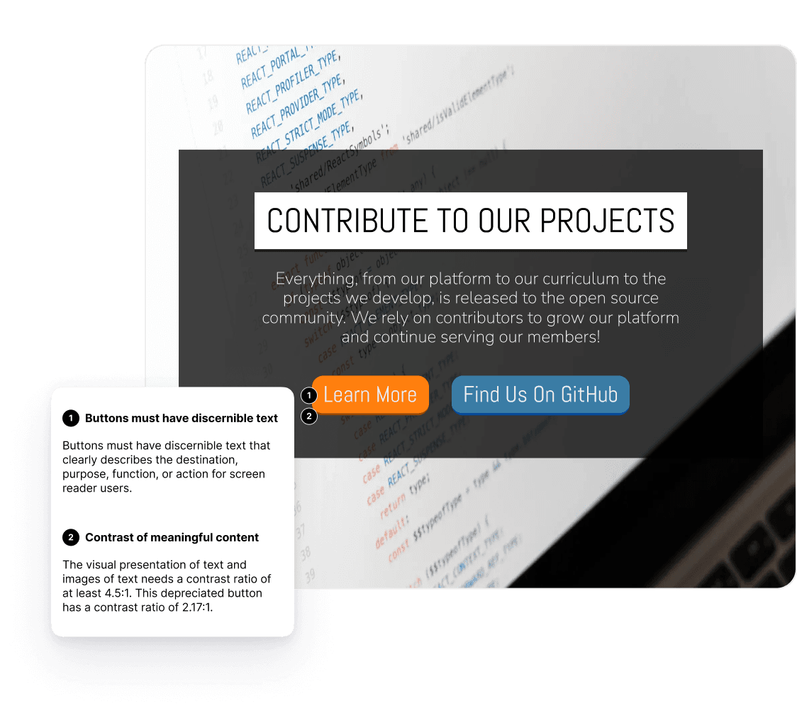
Previous designs did not adequately address the needs of all users including contrast issues, non-descriptive link text and color defining meaning.
solution overview
For designers with limited experience regarding creating accessible designs utilizing building blocks with accessibility incorporated helps them learn through practice while maintaining organizational consistency.
projected impact
Accessible components will help designers build products that are accessible in a friction free learning environment. Accessibility-focused guidelines will enhance user experience for all users.

Atomic and Modular Design
Atomic and modular design enable scalable and consistent UI development by using smaller, reusable components as the foundation for more complex elements.
challenges addressed
Inconsistency in UI Elements: Previously, different teams used varied design elements, leading to a fragmented user experience.
Inefficiency in Design and Development: Repeated creation of similar components wasted time and resources.
solution overview
Implementing an atomic design system and comprehensive documentation ensures a unified, scalable library of components, facilitating consistent and efficient design across all teams.
projected impact
Adopting an atomic design approach will streamline the design and development process, reducing time spent on creating new UI elements.
Standardized components will enhance user experience by providing a consistent interface across all products.
feedback and insights
testing and feedback
Testing Approach
Feedback and Iteration
Blockers and Pivots
insights and outcomes
Qualitative insights
Feedback from an internal survey of our designers regarded our system as a "WORK OF ART" underscoring its impact and necessity. Improved consistency and efficiency in design and development processes.
100%
In feedback from an internal survey, 100% of designers reported the usefulness of predefined styles as very useful to extremely useful, 4-5 on a 1-5 Likert scale of not useful at all to extremely useful.
6 teams
30+ variable
status + reflection
project status
The project is ongoing, with continuous research, refactoring, and enhancement by the Universal Design Team and Platform Enablement Team. Teams currently consist of 3 UX Designers, 1 Graphic Designer, 3 UX Researchers, 1 Technical Lead, 1 Product Lead, and 1 UX Research Lead.
reflection
Initiating the design system as a solo venture embedded accessibility and systemic coherence from the ground up. This endeavor advanced my design approach and instilled a profound appreciation for the meticulous architecture behind consistent, efficient digital experiences. Collaborating closely with organizational leaders, I continue to refine our design practices, ensuring our documentation on accessibility, best practices, and guidelines is comprehensive and current. As the system matured, I transitioned to a guiding role, mentoring peers to enhance their design acumen and collaborating with the team to implement and incorporate Figma Variants into our system.
