navigate
navigate
navigate

Interactive Classrooms
Reimagining classroom interactivity with a user-friendly touch panel for professors, achieving a 77.25% usability success rate.
Reimagining classroom interactivity with a user-friendly touch panel for professors, achieving a 77.25% usability success rate.
Reimagining classroom interactivity with a user-friendly touch panel for professors, achieving a 77.25% usability success rate.
Reimagining classroom interactivity with a user-friendly touch panel for professors, achieving a 77.25% usability success rate.
Client
St. Edward's University
Season
Spring 2023
Timeline
3 Weeks
discovery highlights

evaluating the current interface
We individually conducted heuristic evaluations to identify potential pain points. Our heuristic evaluations involved evaluating the interface on the principals of Visibility of System Status, Match between System and the Real World, User Control and Freedom, Consistency and Standards, Error Prevention, Recognition rather than Recall, Flexibility and Efficiency of Use, Aesthetic and Minimalist Design, Help users Recognize, Diagnose, and
Recover from Errors, and Help and Documentation.
During my evaluation I found several areas for improvement in the software interface.

affinity Diagram
Using our independent evaluations our team created an affinity diagram to decide which issues to address from our discovery.
Our team found that addressing the unconventional labels and icons used throughout the panel interface would make a significant improvement in creating clarity for professors. This lead us to defining our problem statement below.
Our teachers are confused and frustrated because
they don't understand what the icons and labels mean.
If we can solve this problem,
it would impact teachers positively because it would be easier to use the interface and less frustrating.
It would also benefit our business because the software would get more use.
discovery highlights
evaluating the current interface
We individually conducted heuristic evaluations to identify potential pain points. Our heuristic evaluations involved evaluating the interface on the principals of Visibility of System Status, Match between System and the Real World, User Control and Freedom, Consistency and Standards, Error Prevention, Recognition rather than Recall, Flexibility and Efficiency of Use, Aesthetic and Minimalist Design, Help users Recognize, Diagnose, and
Recover from Errors, and Help and Documentation.
During my evaluation I found several areas for improvement in the software interface.
affinity Diagram
Using our independent evaluations our team created an affinity diagram to decide which issues to address from our discovery.
Our team found that addressing the unconventional labels and icons used throughout the panel interface would make a significant improvement in creating clarity for professors. This lead us to defining our problem statement below.
Our teachers are confused and frustrated because
they don't understand what the icons and labels mean.
If we can solve this problem,
it would impact teachers positively because it would be easier to use the interface and less frustrating.
It would also benefit our business because the software would get more use.
process highlights
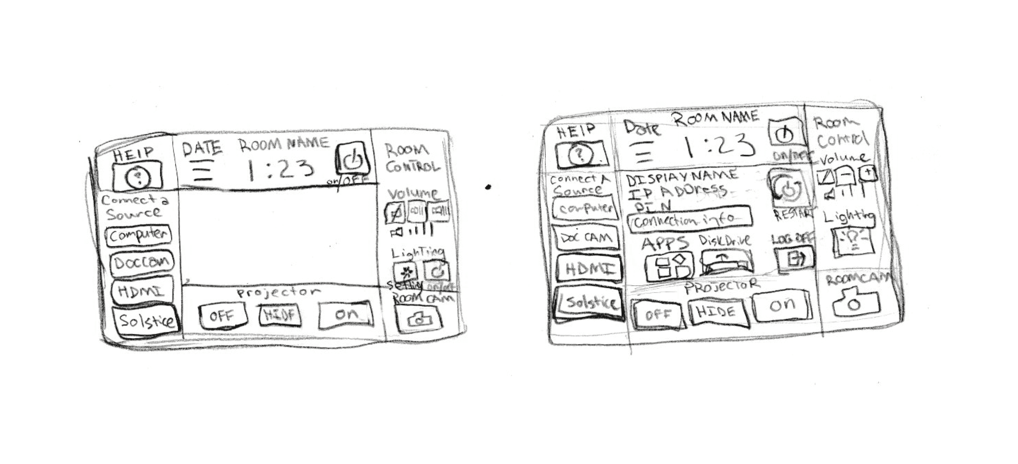
creating sketches
Our team then sketched out solutions to updating the labels and icons and voted on our favorite solutions. My team voted to proceed with my solution sketch.

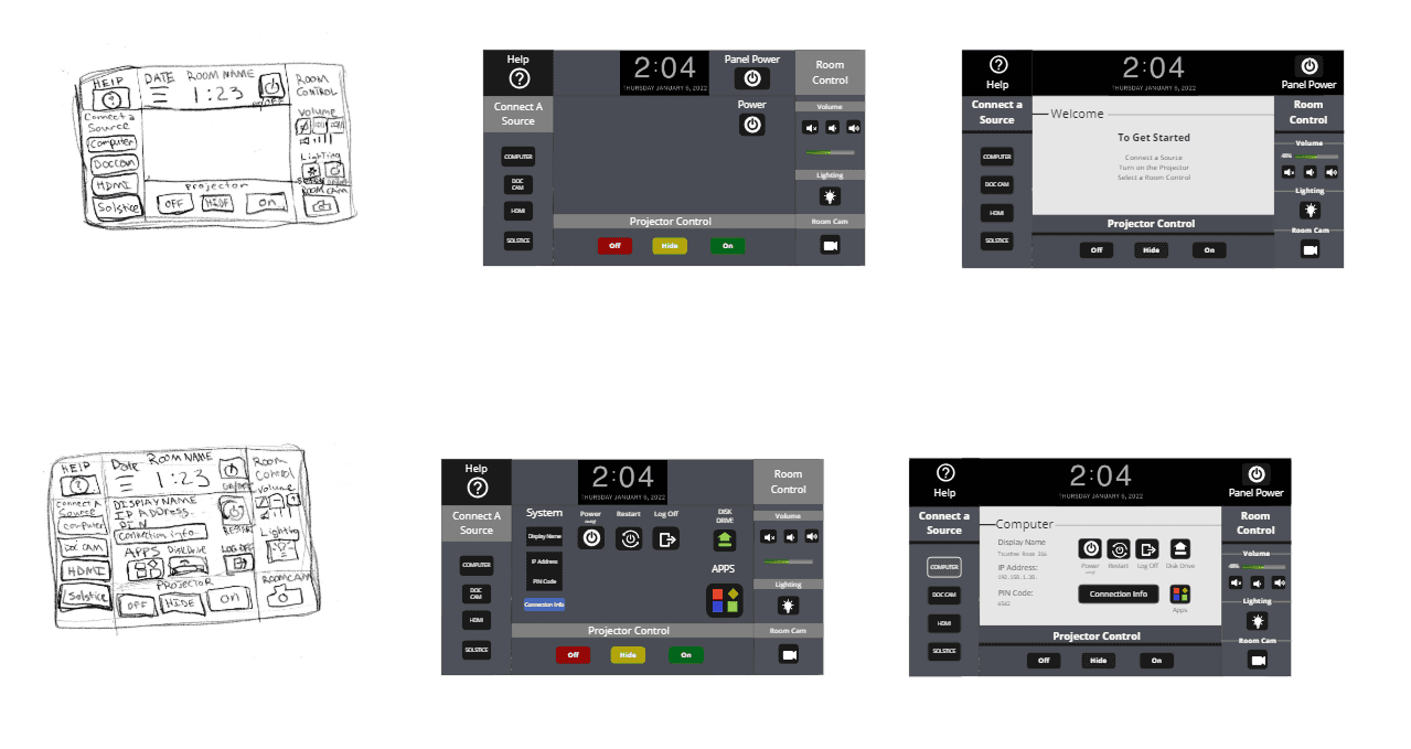
creating prototypes
Using my sketches as a guide we created some prototypes to be tested in a survey with professors.
creating questions
With out prototype created we brainstormed how to test its functionality in a survey format. We discussed which questions we could ask to have the most comprehensive assessment of functionality in our usability survey while prioritizing the stakeholder goals. We brainstormed with sticky notes the most important questions we needed to learn and then organized them into categories that would become the survey sections.

process highlights
creating sketches
Our team then sketched out solutions to updating the labels and icons and voted on our favorite solutions. My team voted to proceed with my solution sketch.
creating prototypes
Using my sketches as a guide we created some prototypes to be tested in a survey with professors.
creating questions
With out prototype created we brainstormed how to test its functionality in a survey format. We discussed which questions we could ask to have the most comprehensive assessment of functionality in our usability survey while prioritizing the stakeholder goals. We brainstormed with sticky notes the most important questions we needed to learn and then organized them into categories that would become the survey sections.
feature highlights


feature highlights
feature highlights
feature highlights
